Performance On Purpose - Rebrand
At 321 The Agency, we were asked to elevate the brand look and feel of Performance On Purpose (POP). The client is a training and coaching company that focuses on creating a high performance mindset.
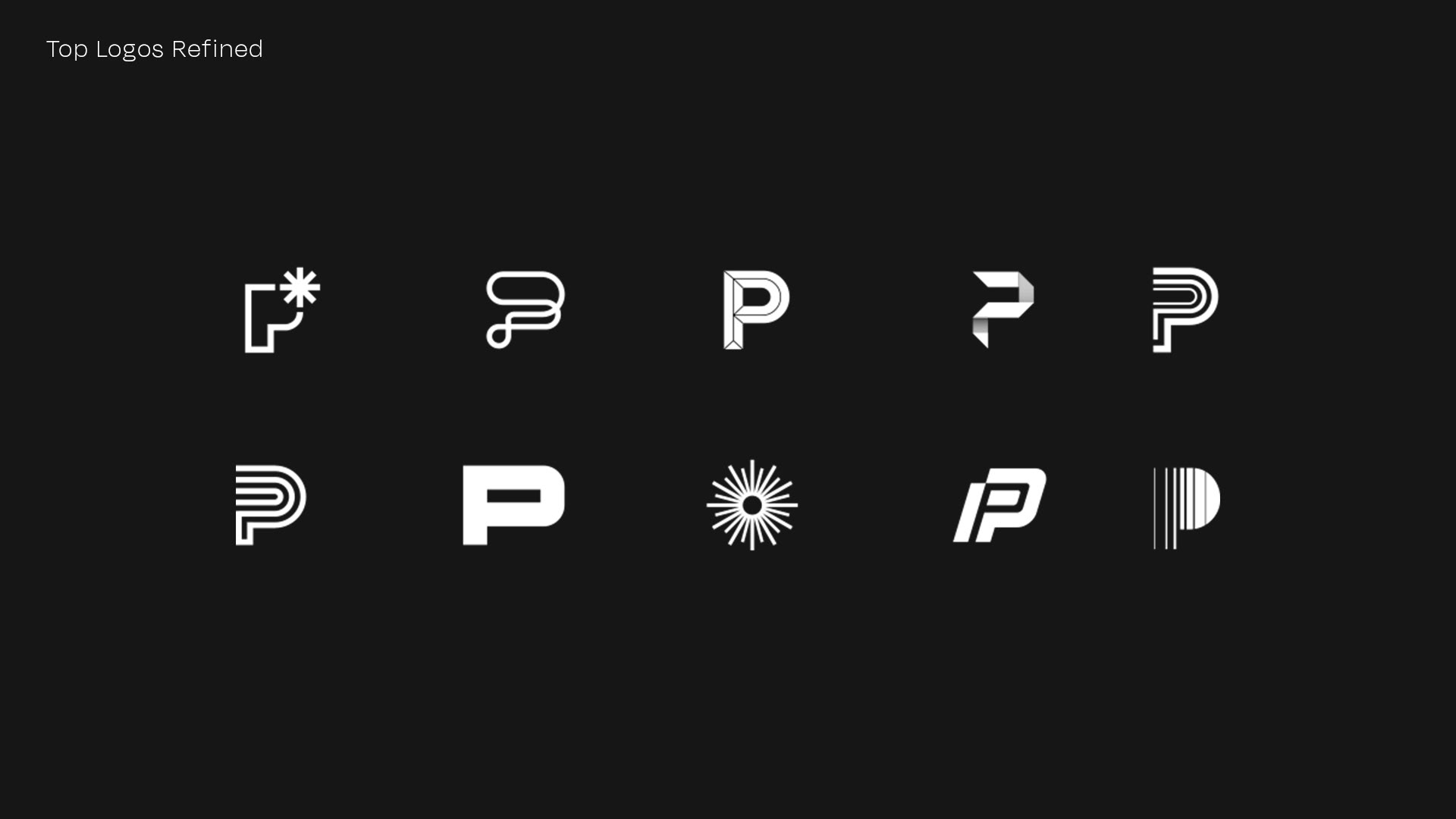
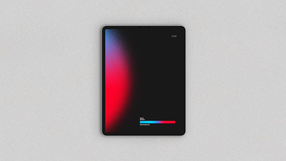
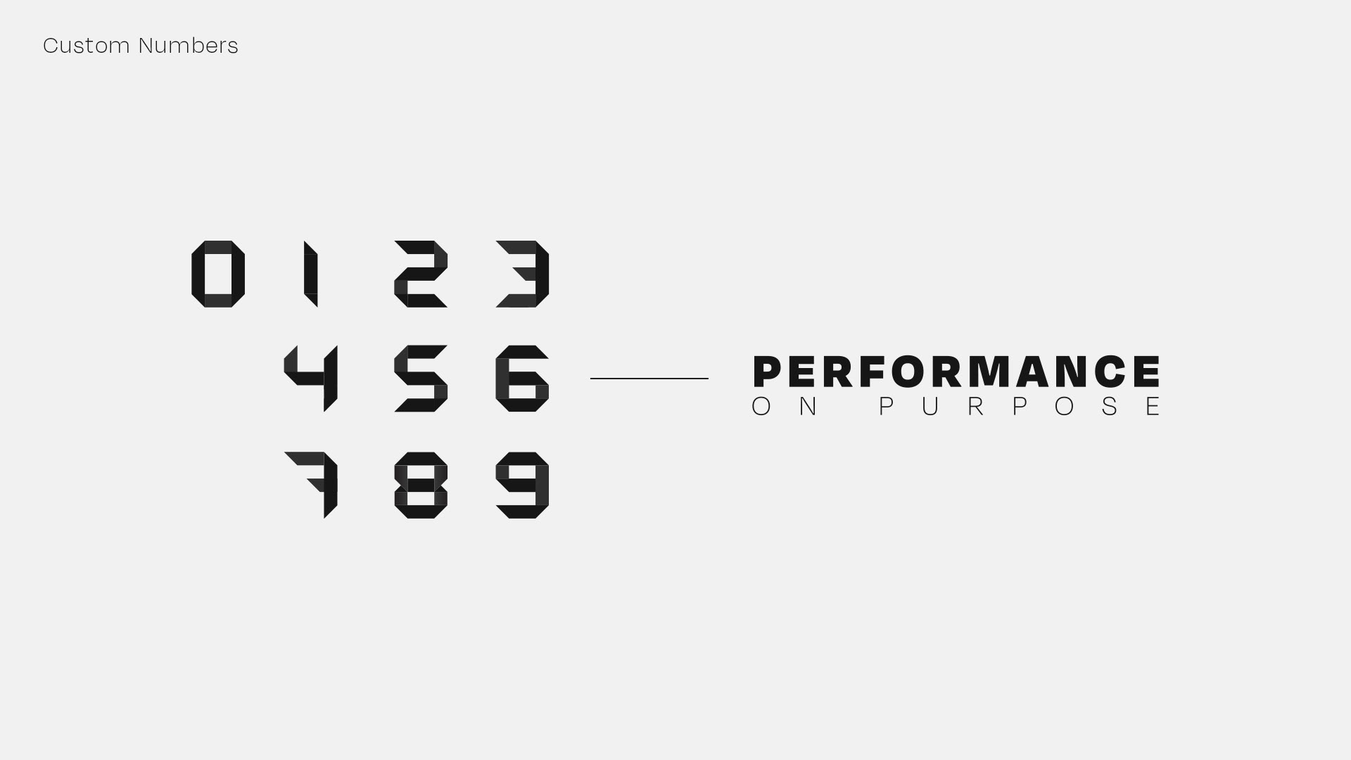
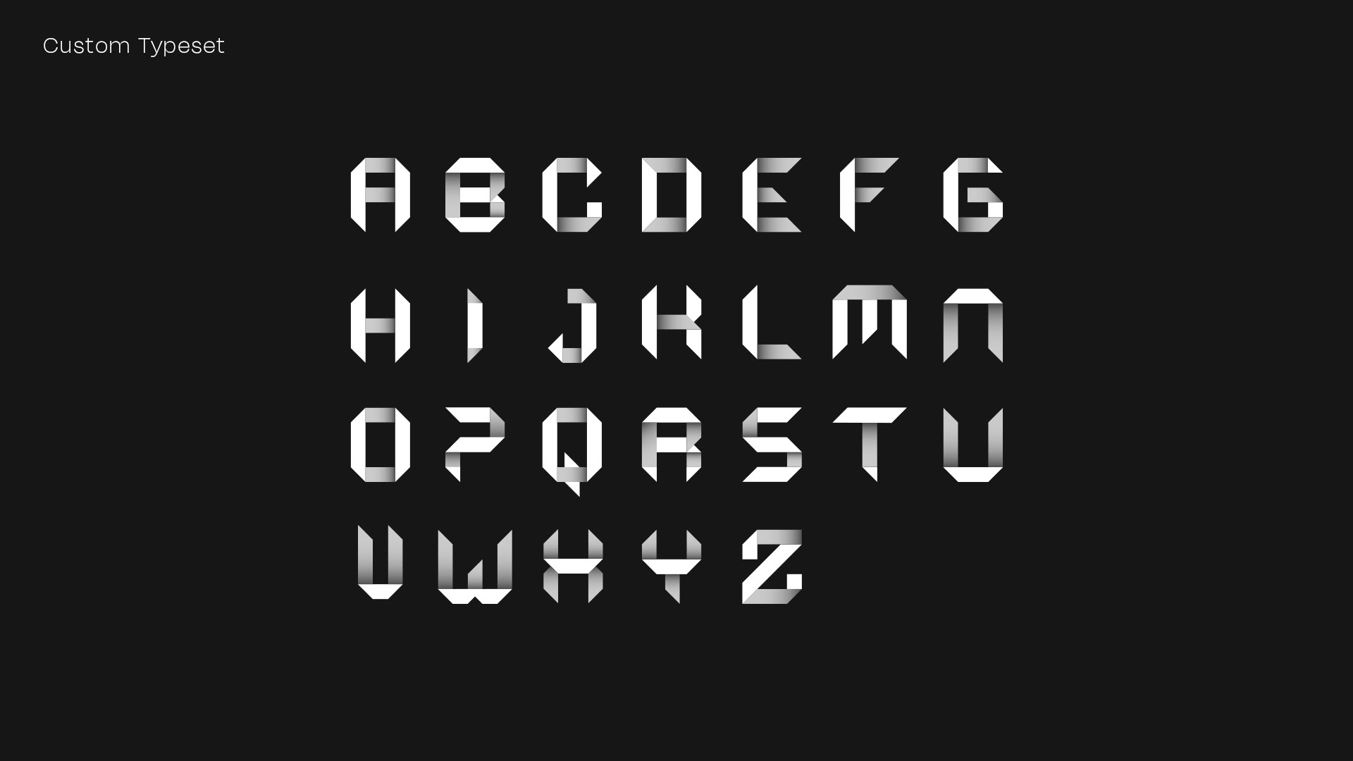
My job was to design a visual identity that would match the level of expertise they provide as a company. Throughout this project you will see the new brand identity for Performance On Purpose and some of the original sketches and logo options that were provided to POP. On top of creating a logo and visual identity. I designed a custom typeset which included 26 letters and 10 numbers designed in the visual style of the icon.


From here on out you will see sketches and other logos designed for the client. The logo exploration was based on keywords that were pulled from a discovery session with the client. , Those keywords were bold, growth, & forward moving.